.png)
Simple pleasures turn into timeless keepsakes
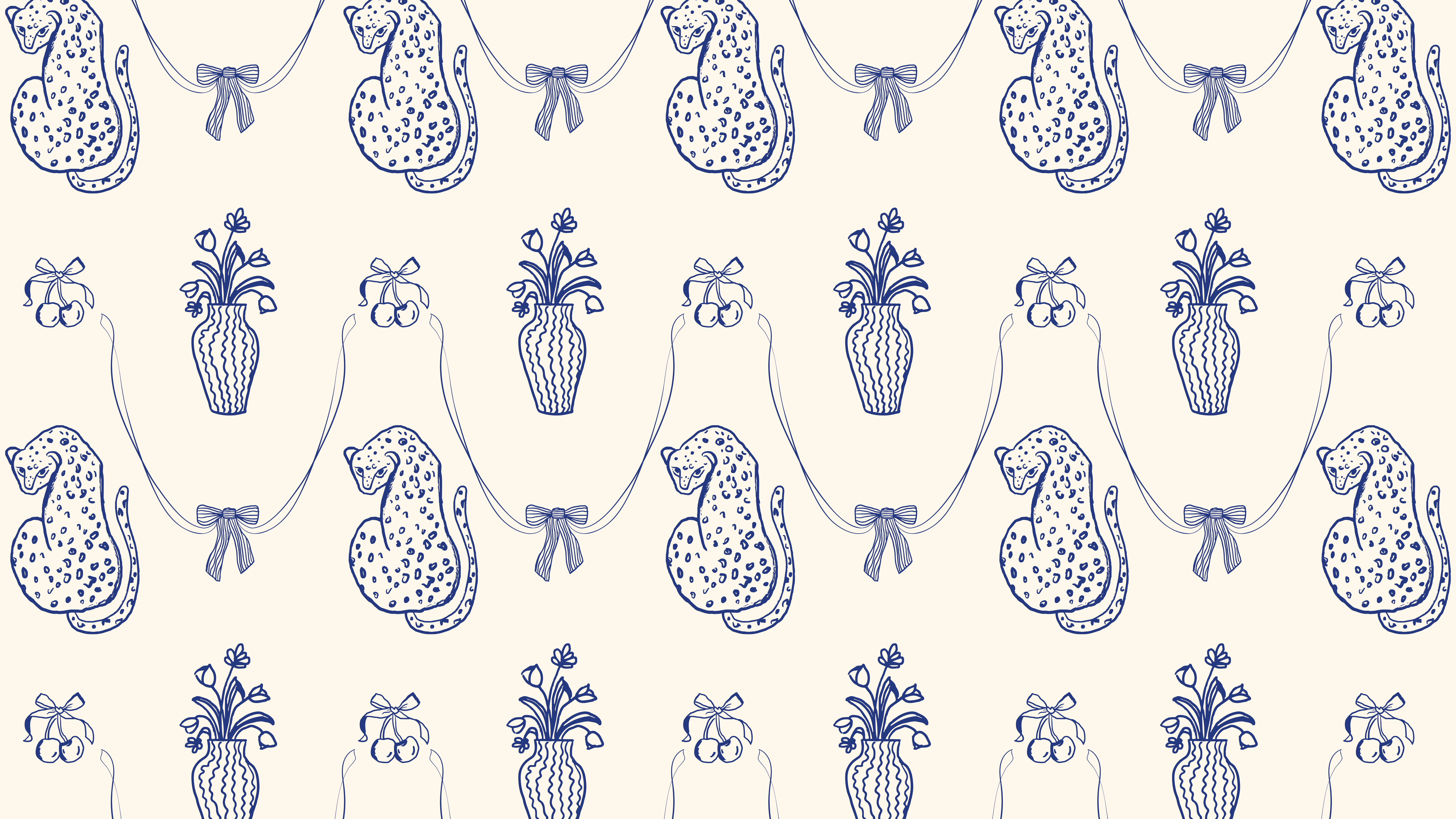
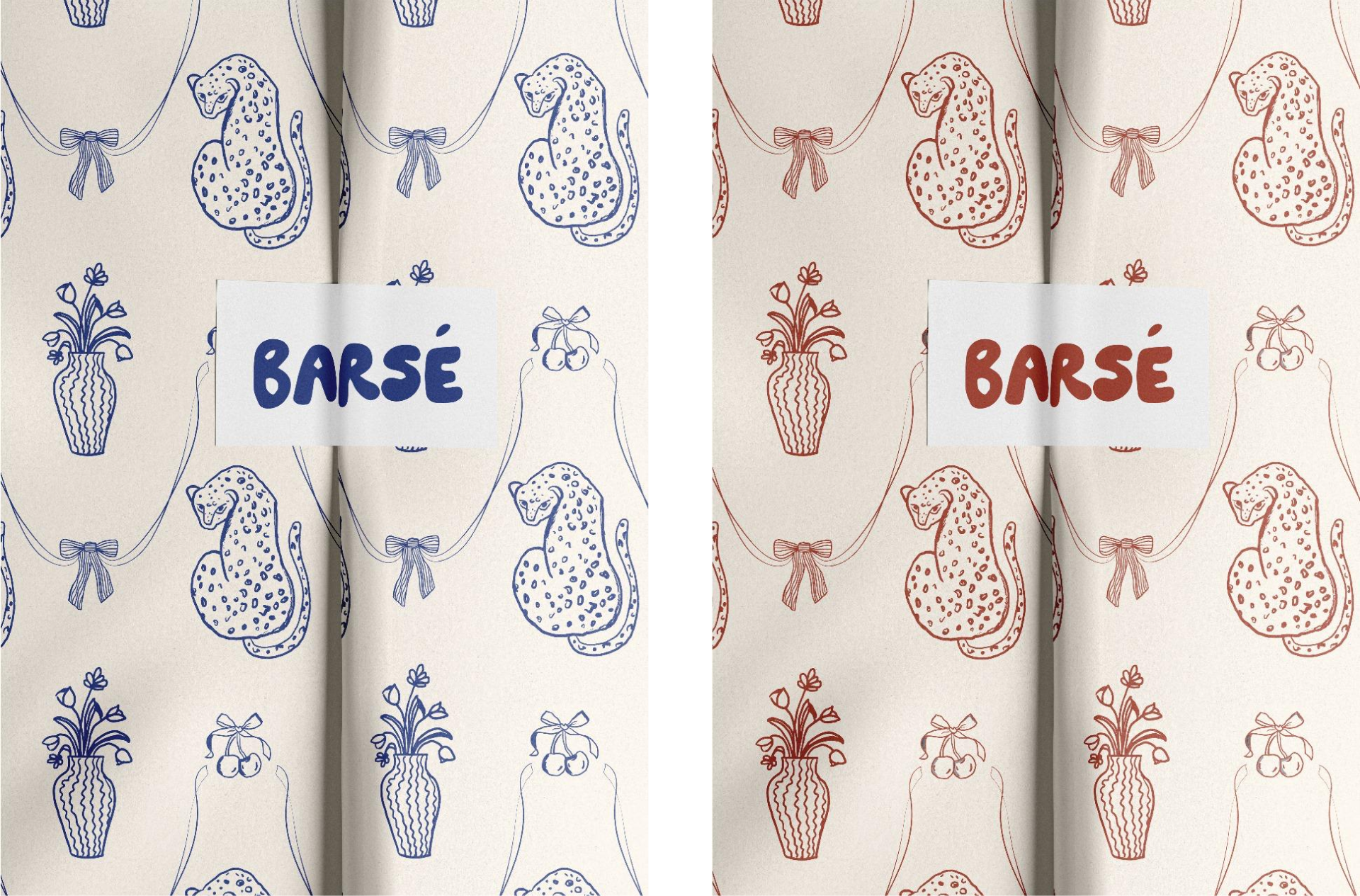
When Rajvi Shah, founder of Barsé, approached us to create her brand's identity, the foundation was already rich with custom, hand-illustrated prints that celebrated the simple joys of life—slices of cake, sunsets, and playful monkeys in groves. Each piece was not just fabric but a tribute to life's moments, lovingly brought to life through hand-drawn illustrations. Our task was to take this visual storytelling and translate it into an overarching brand language that would feel equally expressive, celebratory, and personal.
.png)
We anchored everything around the brand's name, Barsé, which translates to “shower” in Hindi—a rain shower, a shower of colour, and a celebration of life’s vibrancy. This metaphor of rain became the central visual motif for the brand. We envisioned a window filled with clouds, poised in anticipation of a shower—inviting life, colour, and joy to pour in.
We created a chunky, sketch-pen-like logo that felt both playful and fluid—mimicking the way water droplets form and move.
Prelaunch Visuals: A Forecast of Joy
For Barsé’s prelaunch, we leaned into the rain metaphor by creating a whimsical newspaper-style weather forecast. The forecast depicted a sky filled with clouds and the anticipation of a shower, in line with the brand’s ethos of embracing life’s vibrant, spontaneous moments.
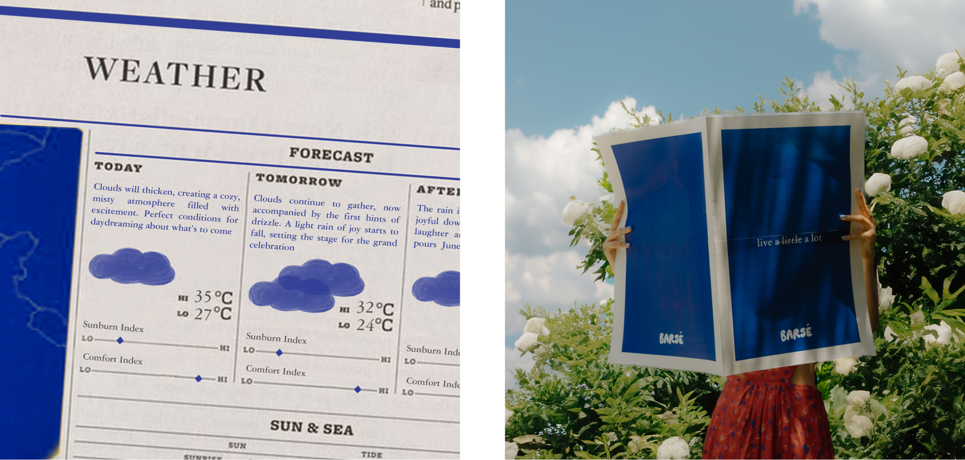
The brand colors—sky blue, deep rain-inspired blue, and accents of pink and red—were used to reflect the essence of nature, florals, and life’s liveliness.
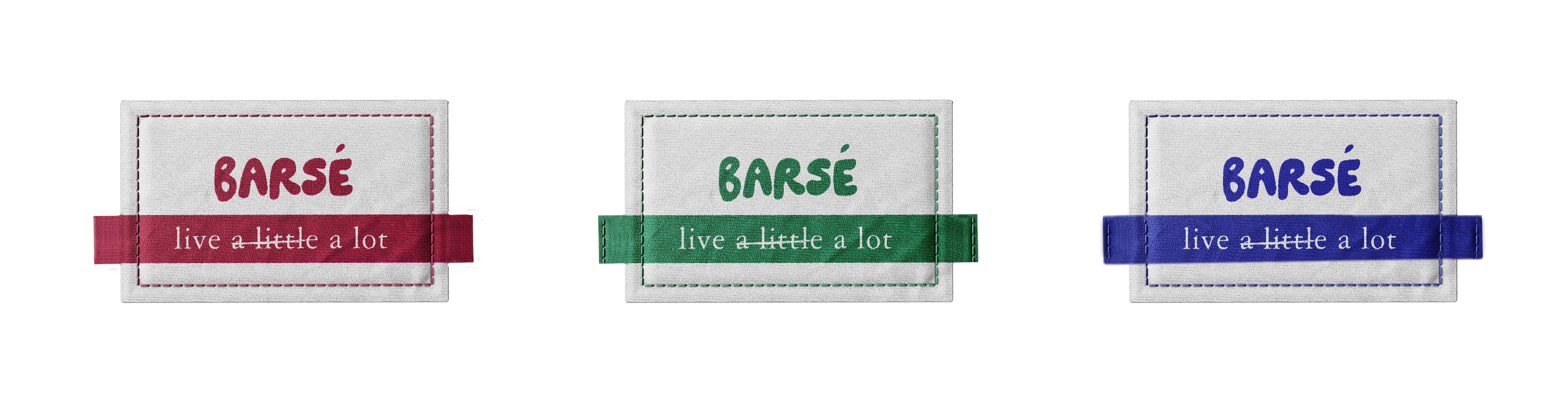
Our stationery design for Barsé focused on the brand’s philosophy of indulgence and living in the moment. Each piece—from product tags to thank-you cards—carried hand-drawn illustrations and life-affirming quotes, emphasizing the brand's core message: don’t wait for the perfect moment—wear the dress and let the occasion find you.
.png)
The clothing tags featured cloud-shaped cutouts that revealed the collection’s prints on the reverse side, with a girl standing joyfully under a rain cloud. The design tied directly to Barsé’s metaphor of life’s showers being opportunities for joy, and the prints were a reminder that life’s vibrancy comes from embracing it fully.
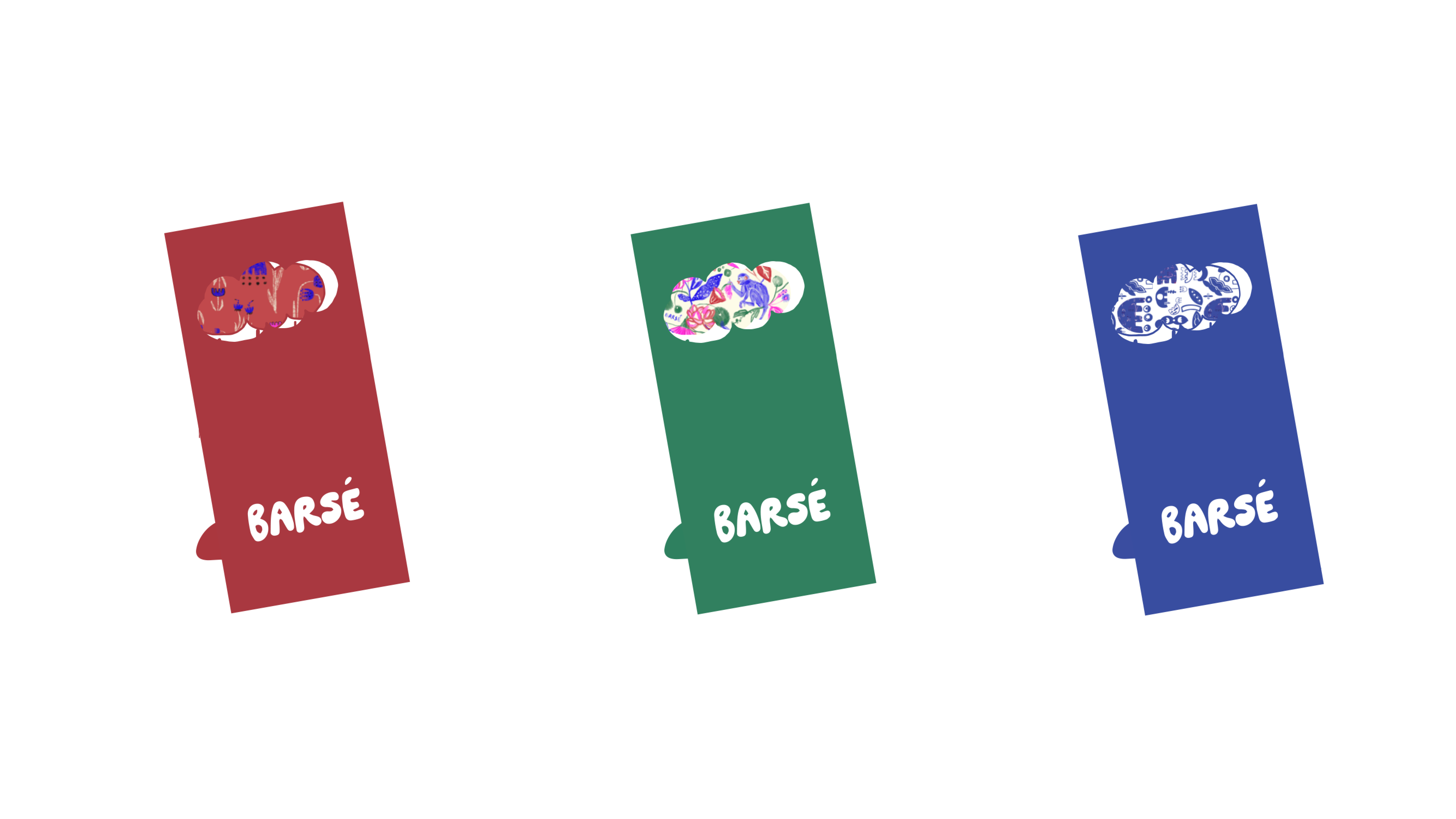
Illustration and Narrative as the Brand’s Core
A crucial step in our process was to extend the language of hand-drawn illustrations into the visual identity of Barsé itself. Our Instagram strategy for Barsé was designed to reflect life as it truly is—a work in progress. With every post, we embraced a raw, unfiltered, and expressive aesthetic, staying true to the brand’s core philosophy of indulgence and self-expression. The grid layout was intentionally fluid, with posts inspired by spontaneous moments of joy, fleeting scenes, and the beauty of imperfection.
We anchored Barsé's identity around its name, which translates to "shower" in Hindi—a rain shower, a shower of color, and a celebration of life's vibrancy. This motif of rain inspired a visual language centered on a window filled with clouds, anticipating a joyous shower. This became the core of Barsé’s launch PR package, where a bird flies in and out of the window, delivering the message “Aao Barsé” (Let’s Rain), symbolizing the brand’s essence of bringing joy and color into every garment.
For the PR box, we crafted an unboxing experience that reflected Barsé’s celebratory spirit. A hatbox, with a balloon filled with confetti, greeted the recipient. When the balloon was popped, a shower of confetti rained down, embodying the brand’s ethos of joy and indulgence, before revealing the products inside—a tactile and immersive celebration of life’s simple moments.
From the fluid, handcrafted logo to the imaginative use of weather forecasts and confetti showers, we created a brand language for Barsé that was as expressive and joyous as its founder’s vision. Every detail—from the launch package to the clothing tags—was meticulously designed to tell a story of indulgence, expression, and celebration, bringing to life the vibrant, joyful essence of Barsé and turning each garment into a love letter to the beauty of living.