Wardrobes inspired by the sun & sea
Zanzibar Living emerges from a passion for travel and a desire to encapsulate the blissful essence of island living. Founded by Surabhi Mehta, the brand is a manifestation of her love for wanderlust and the tranquil allure of coastal life.
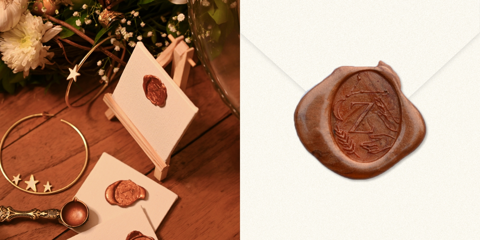
The island embodies both coastal elegance and mystical allure. From the rhythmic waves of the sea to the whispers of ancient secrets carried on the breeze, it transports you to a realm where beauty and mystique intertwine. To symbolize that, we used the crescent moon as a guiding element for the type-based logo. ust as the moon waxes and wanes, the brand evolves and adapts
Ensuring the adaptability of the brand, we created hand-drawn visual touchstones. Whether it be the crescent moon, female hands, a leaf, or a constellation—carries profound meaning, representing themes of timelessness, the strength of women, the transformative power of travel, and their commitment to sustainability.
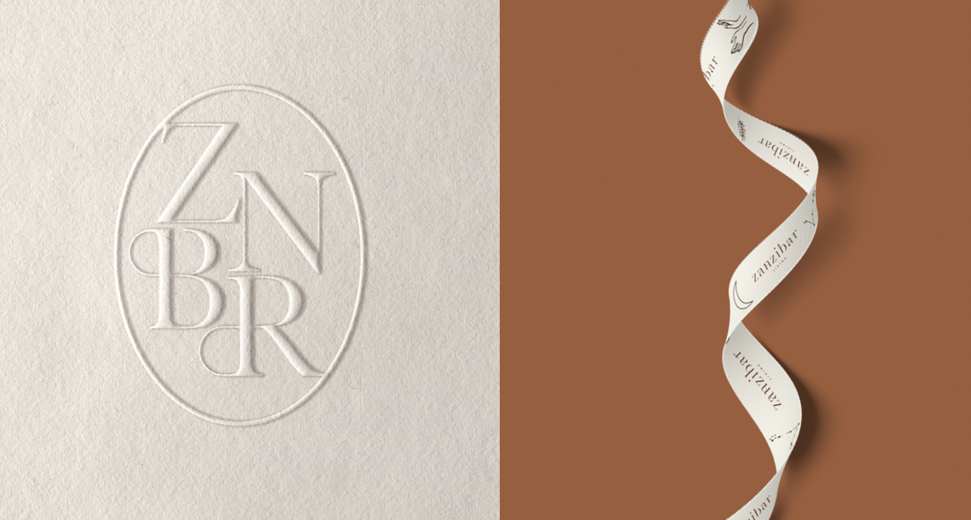
As you unwrap your Zanzibar Living parcel, the sight of these symbols elegantly woven into the ribbon evokes a sense of connection and continuity, seamlessly intertwining with the brand narrative. Beyond mere packaging adornments, these ribbons represent a commitment to attention to detail and a dedication to providing a holistic brand experience.
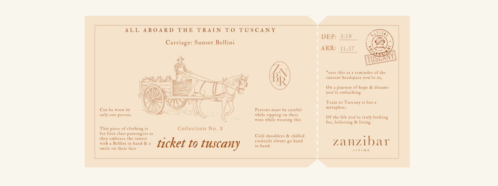
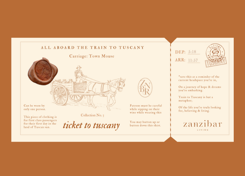
Our approach to copywriting was akin to crafting love letters—each piece of clothing is not just an article of clothing, but a cherished keepsake that becomes an essential part of your wardrobe.
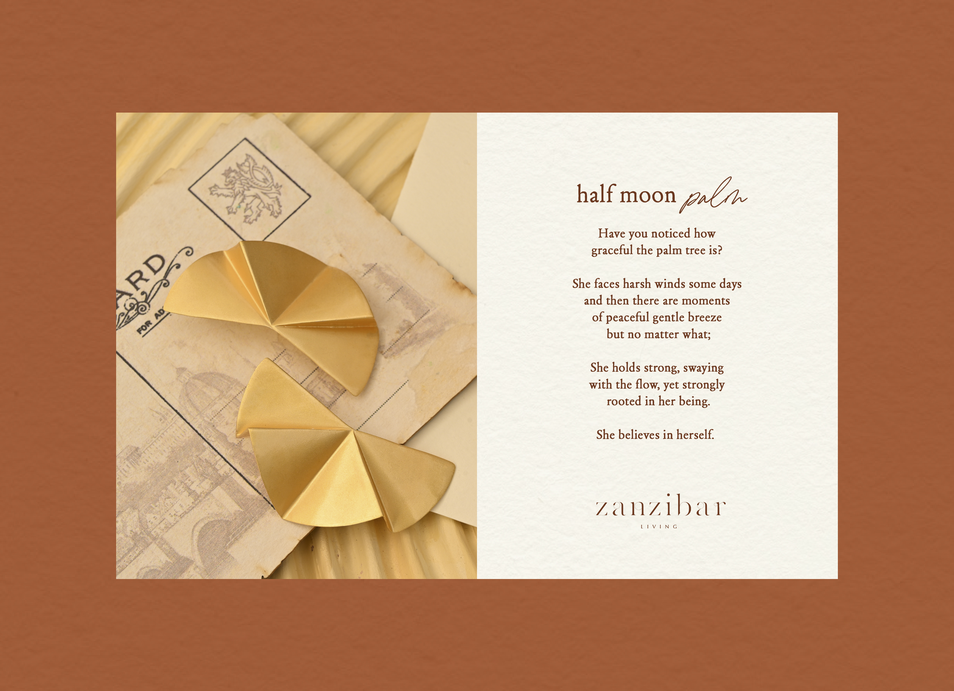
Drawing inspiration from the intimacy of handwritten notes and the nostalgia of love letters, our copywriting style is designed to evoke a sense of authenticity and connection. With postcards, scribbled tickets, and love notes adorning our packaging, each garment is imbued with a story waiting to be unfolded.
The digital experience was designed to transport visitors to an online oasis of island-inspired colors, elements, and sounds. From the moment users landed on the website, they were greeted by a setting sun over the coast. Sound played a pivotal role in enhancing the ambiance of the digital oasis with a customized Zanzibar Living mixtape playing as you shop.
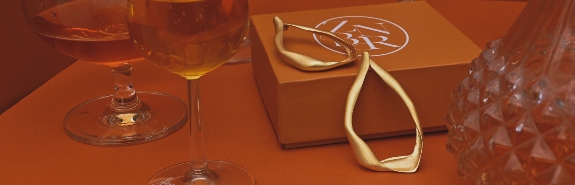
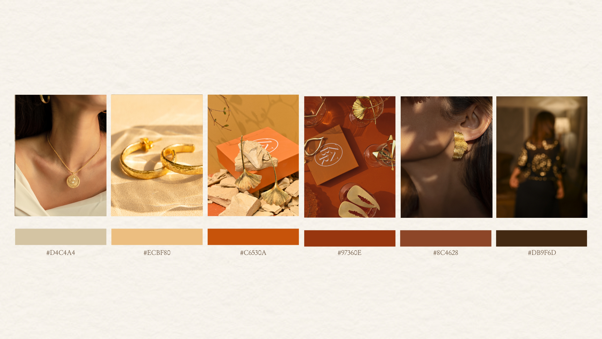
From the vibrant hues of orange Campari drinks to the opulent allure of their gold jewels, each property was carefully chosen to evoke a sense of refined luxury. These rich colors and textures became the cornerstone of our visual strategy, lending an air of exclusivity and indulgence to every touchpoint of the brand experience.


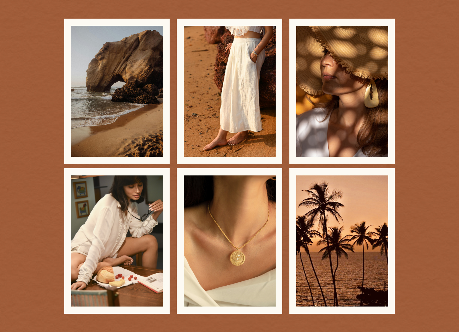
We recognized the importance of capturing the subtle nuances of coastal living—the play of light and shadow, the soothing sounds of nature—as integral components of the brand's identity. In our videos and photography, ambient sounds of the sea and gentle rustling of palm fronds became the backdrop against which the brand's story unfolded, immersing viewers in a sensory journey of relaxation and tranquility.